Fuorisalone Microsite 2024
Experimental website for visitors of Fuorisalone design district 2024 and encapsulating all its exhibits with concise UX/UI design.
Team
5 design coordinators (Me)
No designated roles
Collaborative work
The Problem
The issue of overdesigning and missing the target audience
Many modern day websites tend to overachieve on certain aspects including visual design, without emphasis on the overarching user experience that can enhance the navigation experience with minimal interruptions. We aimed to create an experience where we intend to create a distinctive brand identity for the annual Fuorisalone design festival while bridging the intersections of UX/UI to create a site that is largely experimental and unique.
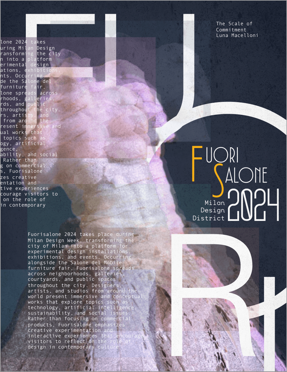
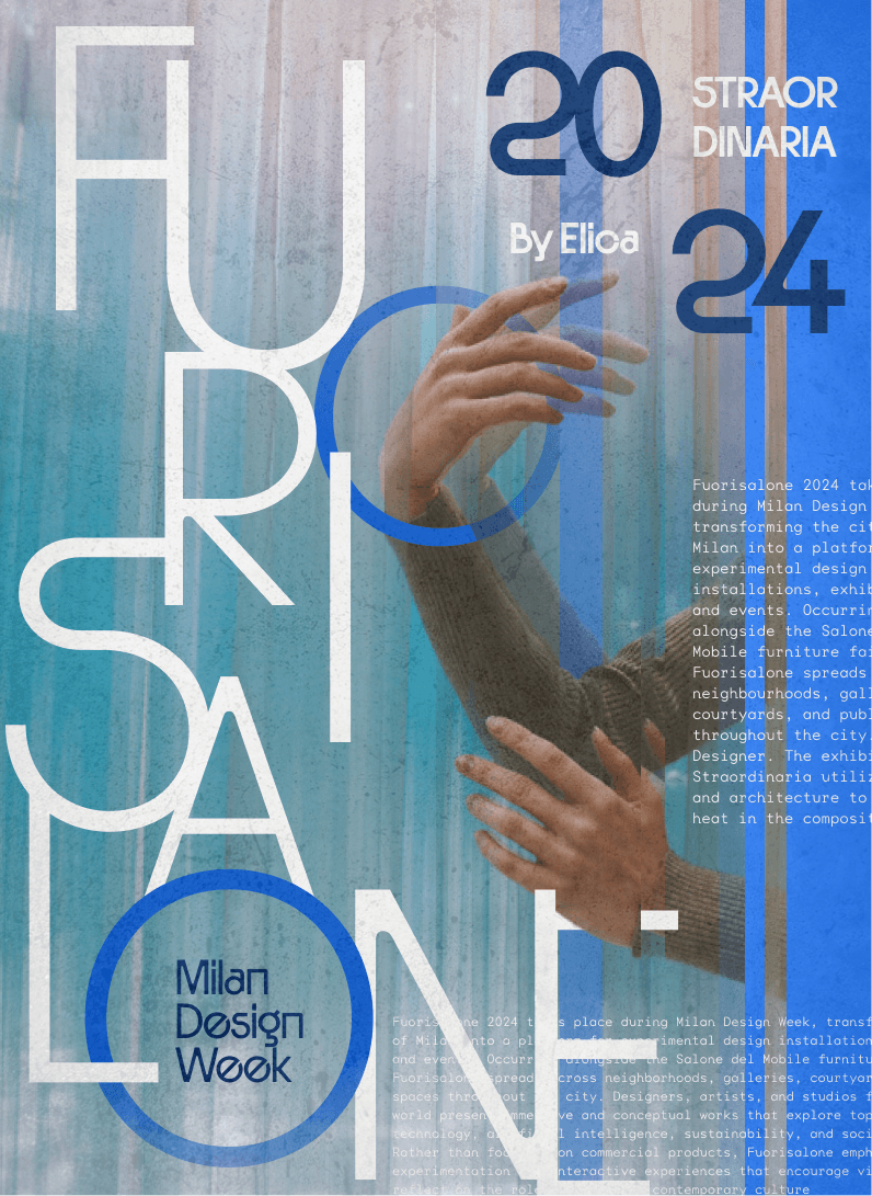
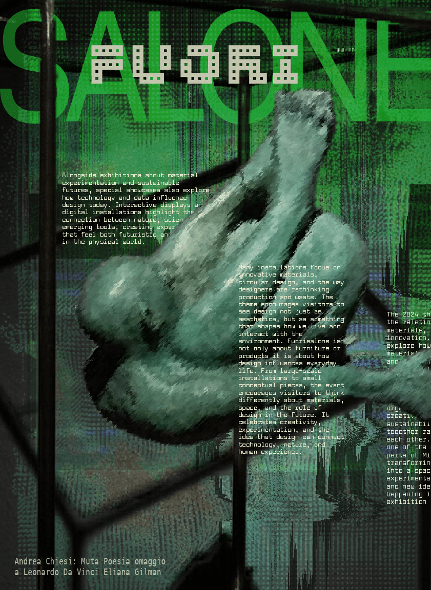
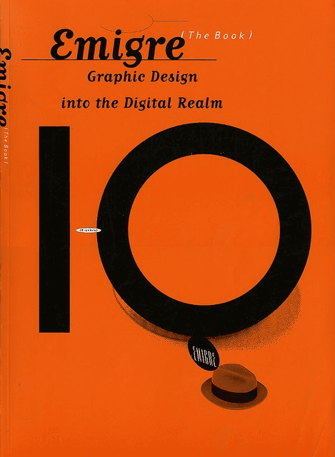
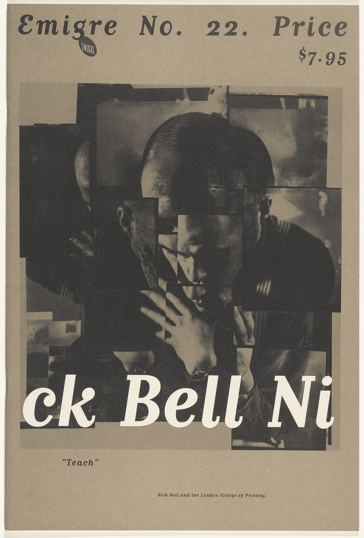
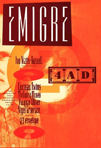
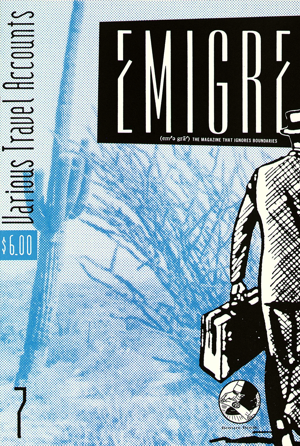
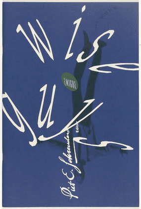
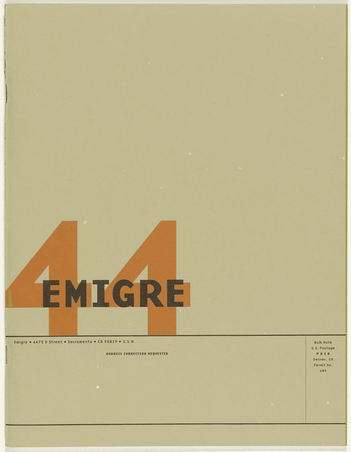
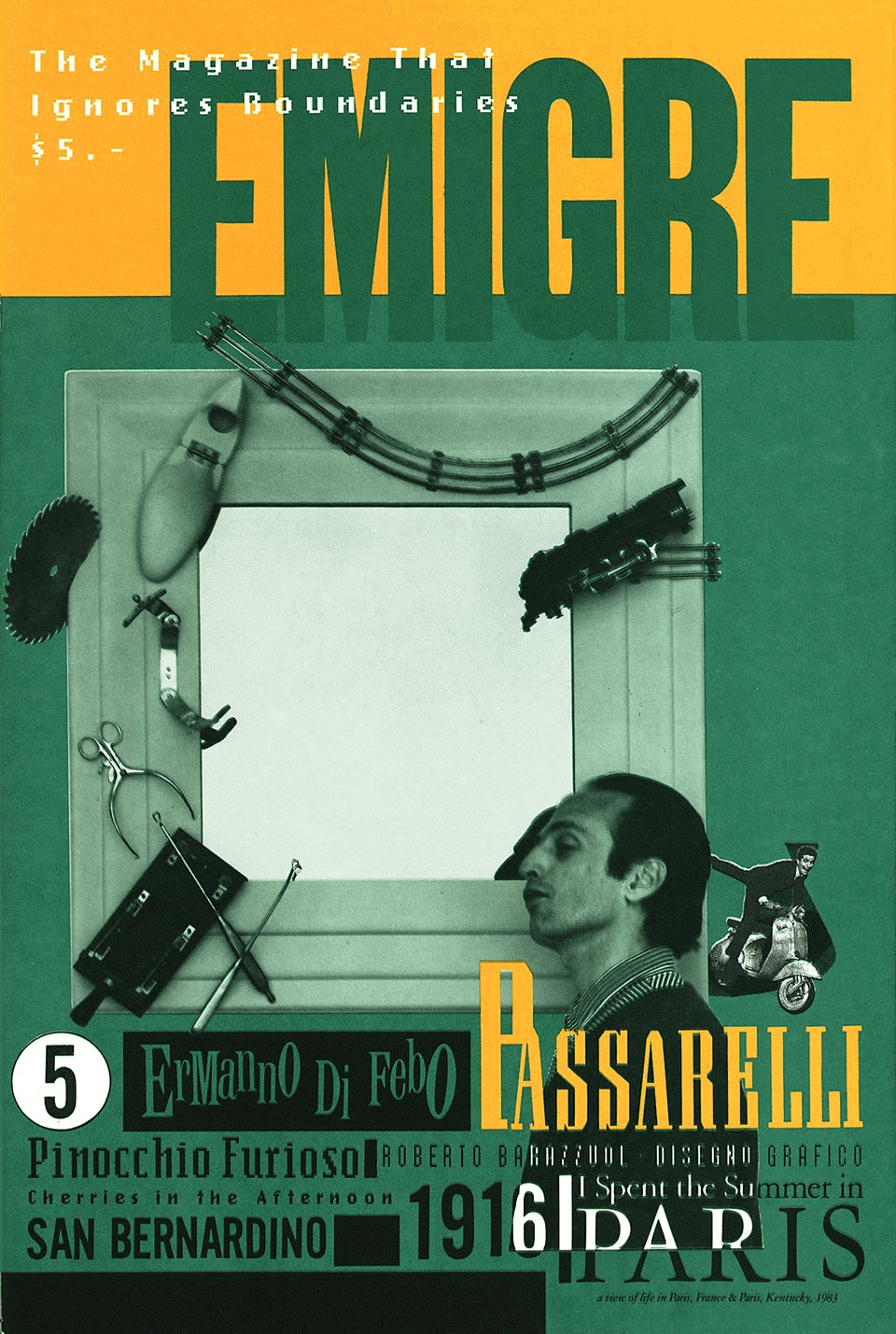
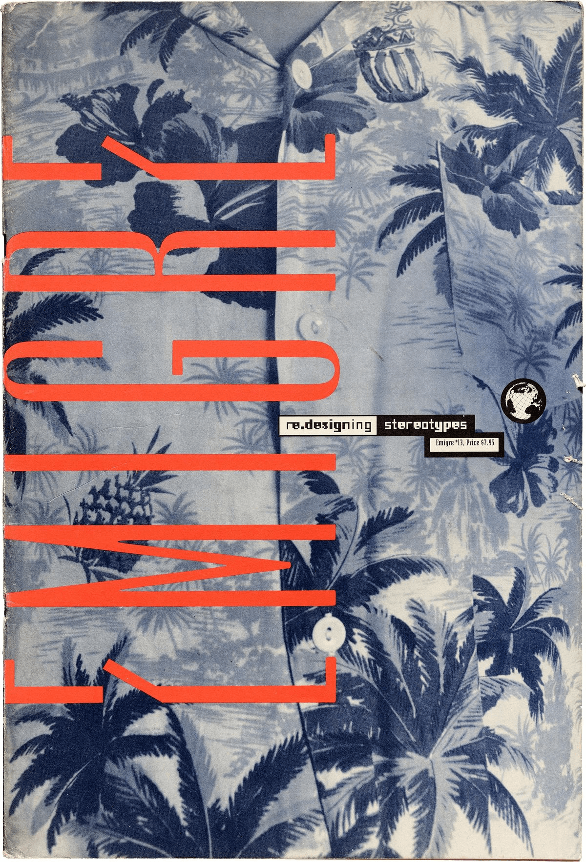
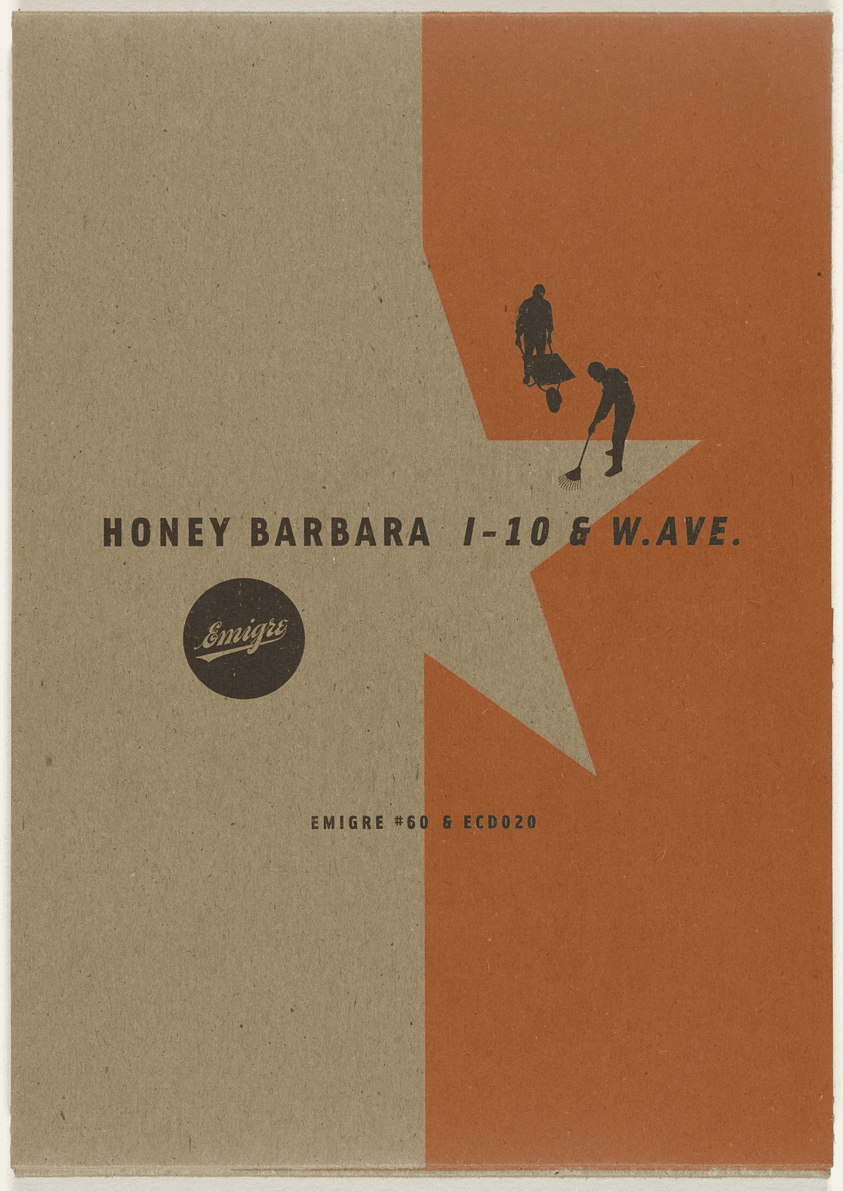
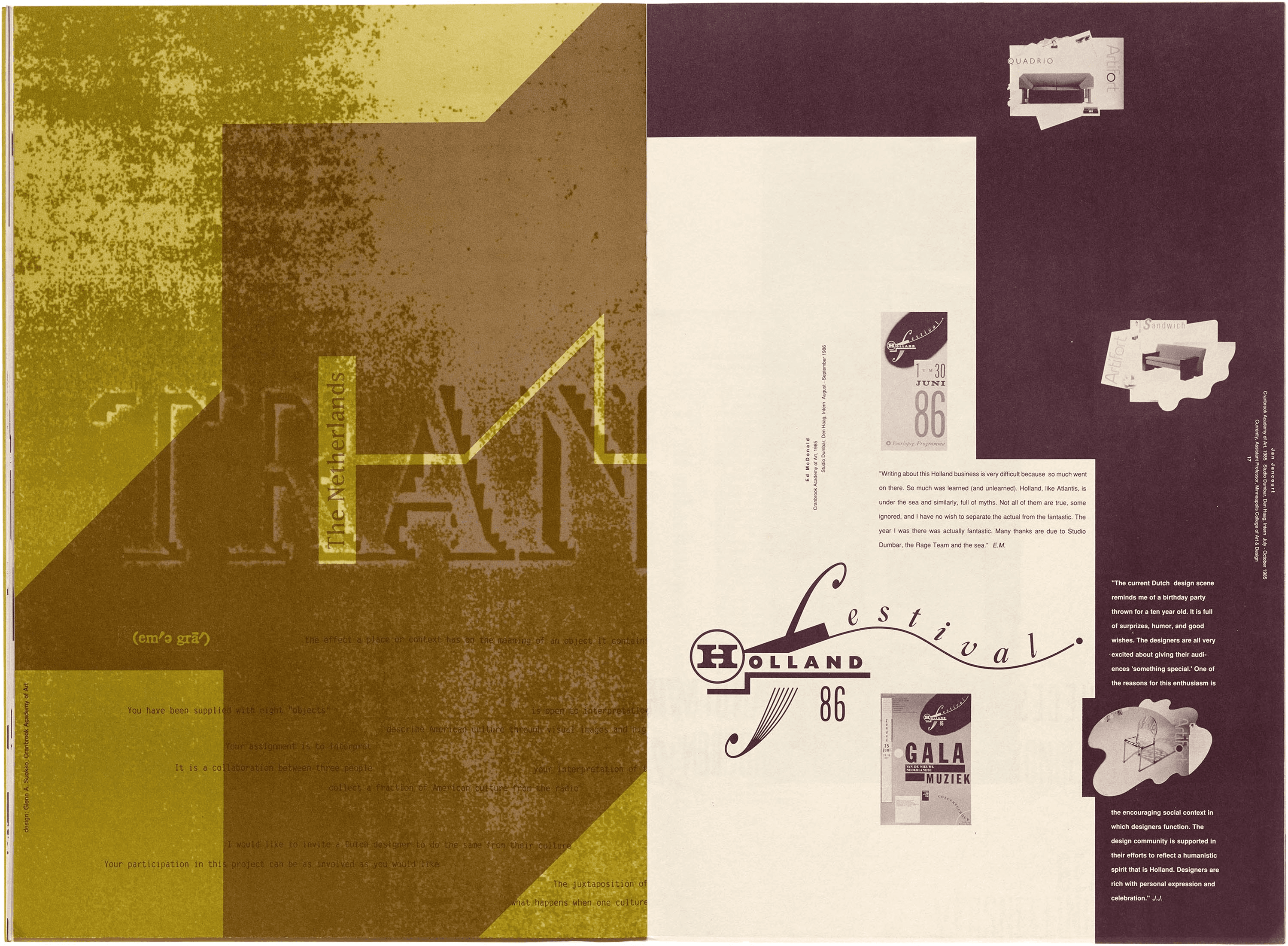
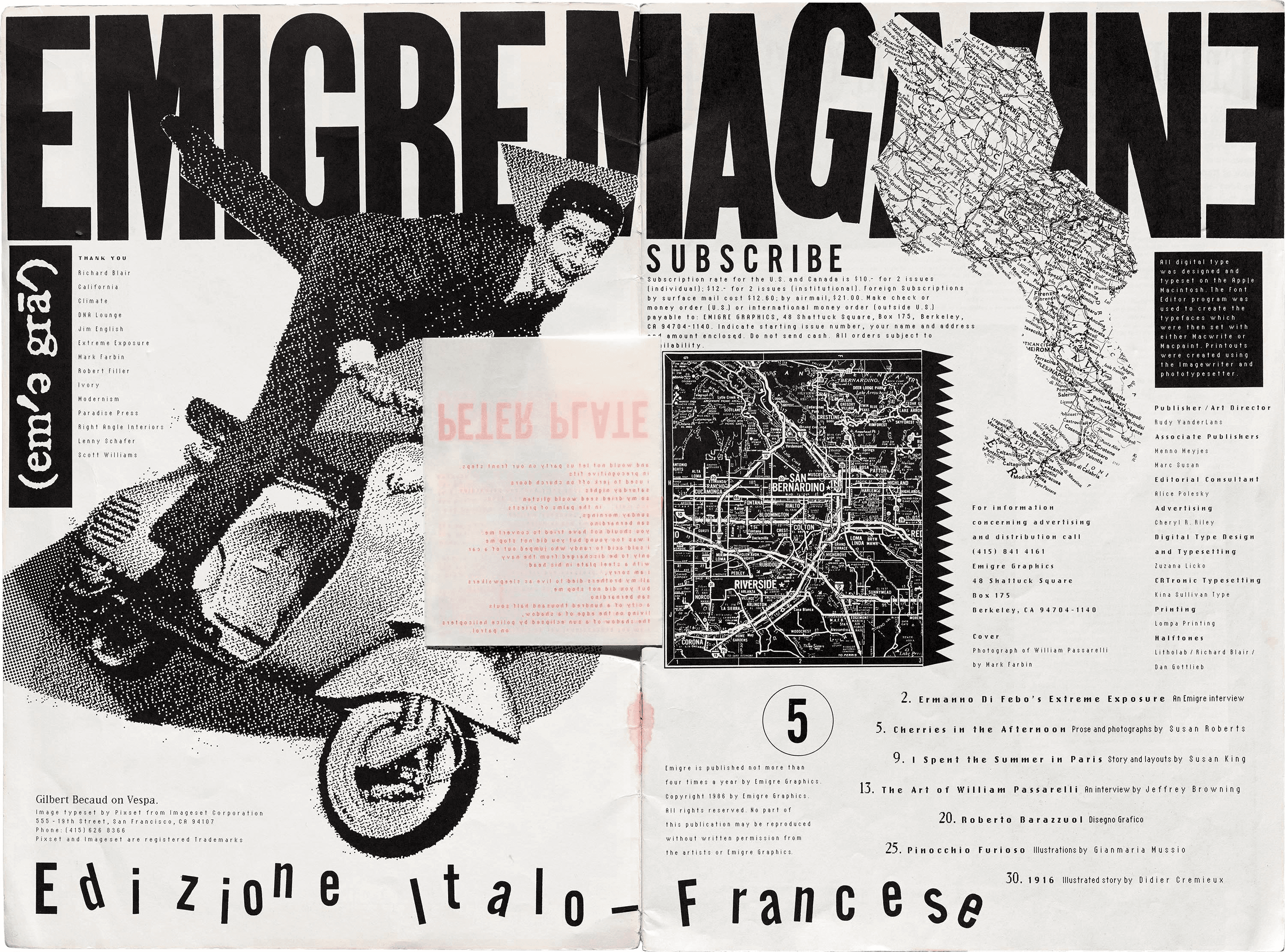
Exploring styles through initial iterations of high-fidelity posters
Many, many poster iterations..

Research
Catering to user personas and iterative design principles
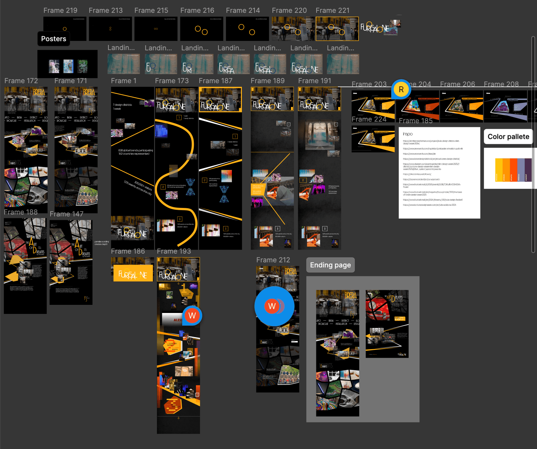
Design process covered work on posters (more experimental), which then translated onto inspiration for our site which can be iterated on and narrowed in further.
Goals:
- Understand personas to converge design decisions
- Pinpoint important design principles to iterate on
Solution ideation
Defining content strategy for implementation
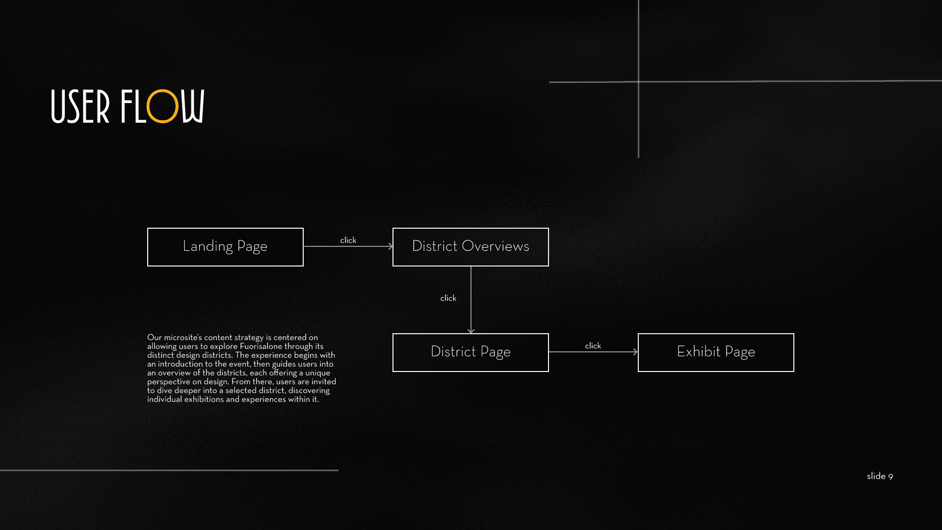
We realized that in order to create a concise and natural experience for visitors, we needed to define a scope for our site, which involved creating user flows to visualize what people would experience to determine what information goes on the site, where it goes etc. I would assist in creating the content directions that guided the information displayed.
Solution ideation
Prototypes and testing
After many long hours of iteration and wireframes, building from our previous ideas, I consolidated our principles and brought them to life with an initial prototype, to see how things would look like in practice and prepared for feedback from users.
Final Solution
Implementation and Website flow
After taking in feedback about our initial prototype being the problem that users would have to figure out which interactions to choose first and how to get to them easier, we had to find a way to make that easier.
I chose to settle on a design that would use presentation principles to garner interest and not have the user second guess which features they missed. After the district showcase, I let them explore the different sections via interactive features.
Key Learnings
Designing interactions with constraints sharpens decisions. Working with new design features in Figma in tandem with brand identity and user flow across multiple weeks, It allows me to create from a set of trials that allows me to find the best designs to iterate towards.
Don’t be complacent with design. Good design is a process that requires drawing inspiration and learning from previous works. As such, I could not afford to be stagnant with my designs, but to always seek out and not assume that my design is “the current best design” in my head.
Take your time. Styling and aesthetic are all aspects that take a good amount of time and research, and if you leave out the people and interaction factors, you’ll start to deviate from who you are designing for and for what purpose.